A high-performance animation reference curated for vibe coding. Just share the URL to get precise code from any AI.
77件のスニペットsnippets
FlowLoopFlowLoopFlowLoop
M-001M: Animation
Text Flow Basicテキストが横方向に流れる基本アニメーション
Gradient text scrolls horizontally in an infinite loop with speed controlled via a custom property.グラデーションテキストを無限ループで横方向に流し、スピードをカスタムプロパティで制御します。
textgradientloop
View Details
M-002M: Animation
Neon Pulse Buttonネオン発光ボタン
A gradient CTA button breathes with a neon glow whose intensity and speed are adjustable via custom properties.グラデーションCTAが呼吸するように発光し、強度やスピードをカスタムプロパティで調整できます。
buttonglowpulse
View Details
Card 1
Description
Card 2
Description
Card 3
Description
Card 4
Description
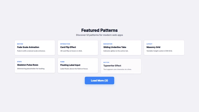
M-003M: Animation
Fade Scale Animationフェードスケールアニメーション
Elements fade in while scaling up for entrance animations with staggered delays.要素がフェードインしながらスケールアップして表示されるエントランスアニメーション。
fadescaleentrance
View Details
Card Title
Hover to see the lift effect
Card Title
Hover to see the lift effect
Card Title
Hover to see the lift effect
M-004M: Animation
Hover Lift Effectホバーリフトエフェクト
Cards lift up on hover with expanded shadows. Adjust lift height and shadow intensity.ホバー時にカードが浮き上がり影が拡大するエフェクト。リフト高さと影の強度を調整できます。
hoverliftshadow
View Details
Beautifultextanimationsmadesimple
M-005M: Text Animation
Text Reveal Slideテキストスライド表示
Beautiful animation where text slides up word by word from below. Customize reveal speed and word delay.テキストが単語ごとに下からスライドして表示される美しいアニメーション。表示速度と間隔を調整できます。
textrevealslide
View Details
パーティクル背景Particle Background
M-006M: Background
Particle Backgroundパーティクル背景
Floating particles in the background. Customize particle count, speed, and colors.背景に浮遊するパーティクルアニメーション。粒子の数、速度、色をカスタマイズできます。
A WebGL hero background using ridged simplex noise to render deep-green to cyan beams, with mouse-driven drift.Simplexノイズのリッジ発光で、深緑→シアンのビームが流れるWebGL背景。マウスで揺らぎを操作。
webglglslshader
View Details
Mesh
Build Beautiful
M-015M: Background
Gradient Mesh Hero Backgroundグラデーションメッシュ(FV背景)
Five blurred radial-gradient orbs float on CSS keyframes, blending into a vivid mesh — a WebGL-free hero background.5つのぼかしオーブが CSS keyframes で浮遊し、WebGLなしで生成感のあるメッシュグラデーション背景を実現。
gradientmeshbackground
View Details
S-001S: Loading
Skeleton Pulse Rowsスケルトンパルス行
Shimmering skeleton rows for list-loading states with adjustable speed.リスト読み込み時の骨組み表示をシマーアニメーションで表現するパターン。
loadingskeletonshimmer
View Details
S-002S: Loading
Dot Wave Loaderドットウェーブローダー
CSS-only dot wave loader using staggered animation-delay for each dot. Pure CSS, lightweight, highly customizable.各ドットにanimation-delayをずらすだけでウェーブ効果を実現するCSS専用ローダー。軽量でカスタマイズ性が高い。
animationloadercss
View Details
S-003S: Loading
Spinner Loaderスピナーローダー
Rotating spinner loader. Adjust rotation speed and size via custom properties.回転するスピナーローダー。回転速度とサイズをカスタムプロパティで調整できます。
loaderspinnerrotation
View Details
進捗Progress0%
S-004S: Loading
Progress Barプログレスバー
Progress bar displaying loading progress. Customize animation speed and colors.進捗を表示するプログレスバー。アニメーション速度と色をカスタマイズできます。
progressloadingbar
View Details
S-005S: Loading
Skeleton Cardスケルトンカード
Card-style skeleton loading placeholder. Displays loading state with shimmer animation.カード形式のスケルトンローディング。シマーアニメーションで読み込み状態を表現します。
skeletoncardloading
View Details
S-006S: Notification
Toast Snackbarトースト通知
Slide-in notification from the edge. Adjust display duration and animation speed.画面端からスライドインする一時通知。表示時間とアニメーション速度を調整できます。
toastsnackbarnotification
View Details
コンテンツエリア。ボタンでローディング表示。
Content area. Button shows loading overlay.
読み込み中...
Loading...
S-007S: Loading
Overlay Loaderオーバーレイローダー
Fullscreen loading overlay with fade. Spinner and message.画面全体を覆うローディングオーバーレイ。フェード表示。
Empty state UI with illustration and description for zero-data cases.データがない場合に表示するイラスト付きのエンプティステート。
emptystateplaceholder
View Details
完了Done
S-009S: Feedback
Success Checkmarkサクセスチェック
Animated checkmark drawn to indicate successful completion.完了時に描画されるアニメーションチェックマーク。
successcheckmarkanimation
View Details
Generating···
S-010S: Loading
AI Generating Text LoaderAIテキストローダー
Each letter glows and fades in one by one as a chromatic scan sweeps behind — perfect for AI generation states.文字が1つずつグロー発光しながらフェードインし、クロマティックな光のスキャンが背後を走るAI生成風ローダー。
loadertextgenerating
View Details
N-001N: Navigation
Sliding Underline Tabsスライド下線タブ
A minimal tab navigation where the underline indicator glides to the active item.アクティブタブに合わせて下線インジケーターが滑らかに移動するシンプルなタブナビゲーション。
tabsnavigationindicator
View Details
N-002N: Navigation
Stepper Dot Progressドットステップナビ
A multi-step progress component using dots and a connecting line that animates to the active step.複数ステップの進捗をドットとラインで可視化し、アクティブインジケーターが滑らかに切り替わるステッパーUI。
Dropdown menus that expand on click or hover with adjustable animation speed and direction.クリックまたはホバーで展開するドロップダウンメニュー。アニメーション速度と方向を調整できます。
dropdownmenunavigation
View Details
N-004N: Navigation
Breadcrumb Navigationブレッドクラムナビゲーション
Breadcrumb navigation showing hierarchical structure. Customize separators and hover effects.階層構造を表示するパンくずリストナビゲーション。セパレーターとホバーエフェクトをカスタマイズできます。
breadcrumbnavigationhierarchy
View Details
N-005N: Navigation
Paginationページネーション
Pagination component displaying page numbers. Customize active page highlight and hover effects.ページ番号を表示するページネーションコンポーネント。アクティブページのハイライトとホバーエフェクトをカスタマイズできます。
paginationnavigationpages
View Details
N-006N: Navigation
Back to Topトップへ戻る
Button that appears on scroll and smoothly scrolls back to top on click.スクロール時に表示され、クリックでページトップへスムーズに戻るボタン。
back to topscrollnavigation
View Details
N-007N: Navigation
Floating Action Buttonフローティングアクションボタン
Floating action button at corner. Scale on hover.画面隅に浮かぶアクションボタン。ホバーで拡大。
FABfloatingbutton
View Details
Main Content
Click the toggle button to collapse/expand the sidebar.
N-008N: Navigation
Sidebar Navigationサイドバーナビ
Collapsible sidebar navigation suitable for admin dashboards.折りたたみ可能なサイドバーナビゲーション。
sidebarnavigationmenu
View Details
Brand
Tap to openMobile menu preview
N-009N: Navigation
Hamburger Menuハンバーガーメニュー
Mobile-friendly fullscreen menu with animated toggle icon.モバイル向けフルスクリーンメニューとアニメーションアイコン。
menuhamburgermobile
View Details
Selected command appears here.
N-010N: Navigation
Command Paletteコマンドパレット
Keyboard-first command palette that opens with Ctrl or Cmd + K and filters actions in a modal list.Ctrl / Cmd + K で開き、モーダル内のアクションを絞り込めるキーボード優先のコマンドパレット。
command-palettesearchkeyboard-navigation
View Details
Quick PreviewQuick Preview
開閉を確認できるカード向けモーダルです。A card-sized modal you can open and close.
I-001I: Interaction
Modal Animationモーダルアニメーション
Modal that fades in and scales up. Adjust animation speed and direction.フェードインとスケールで表示されるモーダル。アニメーション速度と方向を調整できます。
modaldialoganimation
View Details
I-002I: Interaction
Button Ripple Effectボタンリップルエフェクト
Ripple effect that expands from click position. Adjust ripple size and speed.ボタンクリック時に波紋が広がるリップルエフェクト。波紋のサイズと速度を調整できます。
buttonrippleclick
View Details
FrontFront
BackBack
I-003I: Interaction
Card Flipカードフリップ
3D card flip animation on click or hover. Adjust rotation axis and speed.カードをクリックまたはホバーで裏返すフリップアニメーション。回転軸と速度を調整できます。
flipcard3d
View Details
上TopTooltip on top
下BottomTooltip on bottom
左LeftTooltip on left
右RightTooltip on right
I-004I: Interaction
Tooltipツールチップ
Tooltip that appears on hover. Customize position, animation, and styling.ホバー時に表示されるツールチップ。位置、アニメーション、スタイルをカスタマイズできます。
tooltiphoverinformation
View Details
セクション 1Section 1
これは最初のセクションのコンテンツです。アコーディオンをクリックすると展開されます。This is the content for the first section. Click the accordion to expand it.
セクション 2Section 2
これは2番目のセクションのコンテンツです。複数のセクションを同時に開くことができます。This is the content for the second section. Multiple sections can be open at the same time.
セクション 3Section 3
これは3番目のセクションのコンテンツです。FAQや詳細情報の表示に適しています。This is the content for the third section. Ideal for FAQs and detailed information display.
I-005I: Interaction
Accordionアコーディオン
Accordion that expands and collapses on click. Customize animation speed and styling.クリックで展開/折りたたみができるアコーディオン。アニメーション速度とスタイルをカスタマイズできます。
Sortable list interface using drag and drop interactions.項目の並べ替えが可能なドラッグ&ドロップリスト。
dragdropsortable
View Details
Nature
River
Canyon
I-008I: Interaction
Image Carousel画像カルーセル
Basic image slider with manual navigation controls.スワイプやボタンで画像を切り替える基本的なスライダー。
carouselslidergallery
View Details
npm i devsnips-ui
I-009I: Interaction
Copy to Clipboardコピーボタン
Button that copies text to clipboard and shows feedback.クリックでテキストをコピーし、フィードバックを表示するボタン。
copyclipboardbutton
View Details
Cookie 設定Cookie Preferences
使用するCookieの種類を選択できます。Choose which cookies you allow.
必須NecessaryRequired
分析Analytics
マーケティングMarketing
機能性Functional
当サイトではCookieを使用しています。「設定」から種類を選択できます。We use cookies. Click "Settings" to customize.
I-010I: Interaction
Cookie Consent BannerCookie コンセントバナー
GDPR-style cookie consent banner that slides in from the bottom on first visit with Accept/Decline actions.初回訪問時にスライドインするGDPRスタイルのCookieコンセントバナー。Accept/Declineの操作で非表示に。
cookieconsentbanner
View Details
すべて表示しましたAll items loaded
I-011I: Interaction
Load More Buttonロードモアボタン
Reveals the next batch of items with a fade-slide-up animation. Shows remaining count and a loading spinner.クリックで次バッチをフェードインで追加表示するロードモアボタン。残件数表示とスピナー付き。
load morepaginationlist
View Details
F-001F: Form
Floating Label Inputフローティングラベル入力
Material Design-style input where the label floats up on focus.フォーカス時にラベルが上部に移動するマテリアルデザイン風の入力フィールド。
forminputlabel
View Details
カテゴリを選択Select a category
Motion / Visual
Navigation
Layout / Structure
State / Loading
Theme / Behavior
Form / Input
F-002F: Form
Custom Select Dropdownカスタムセレクト
Fully styleable custom select box with animated dropdown options.スタイリング可能なカスタムセレクトボックス。アニメーション付きのドロップダウン。
formselectdropdown
View Details
チェックボックスCheckbox
ラジオボタンRadio Buttons
F-003F: Form
Checkbox & Radio Buttonsチェックボックス&ラジオ
Animated custom checkboxes and radio buttons.アニメーションするカスタムチェックボックスとラジオボタン。
formcheckboxradio
View Details
✓✕⚠
有効なメールアドレスですValid email address
無効なメールアドレスですInvalid email address
このメールは既に使用されている可能性がありますThis email may already be in use
F-004F: Form
Input Validation Statesバリデーションステート
Visual feedback patterns for input success and error states.入力内容の成功・エラー状態を視覚的にフィードバックするパターン。
formvalidationerror
View Details
🔍
F-005F: Form
Search with Suggestionsサジェスト検索
Autocomplete search box that displays a suggestion list while typing.入力中に候補リストを表示するオートコンプリート検索ボックス。
formsearchautocomplete
View Details
NEW
Design-focused layout block.
L-001L: Layout
Split Hero Panelスプリットヒーローパネル
A split hero layout that separates copy and preview panels with a customizable column ratio.コピーとプレビューを左右に分けるヒーローレイアウト。カラム比率をカスタムプロパティで柔軟に変更できます。
herolayoutgrid
View Details
New
Analytics
Realtime insights
Pro
Team Sync
Shared workflows
Basic
Starter
Core toolkit
L-002L: Layout
Layered Card Stackカードスタックレイアウト
Stacked cards that float on hover with offsets controlled by a custom property.ずらしたカードを重ねてホバー時に浮かせるレイアウト。カスタムプロパティでオフセット量を調整できます。
cardsstackhover
View Details
Scroll
Parallax Depth
Background moves slower than the card content.
Keep scrolling
L-003L: Layout
Parallax Scrollパララックススクロール
Background moves slower than foreground on scroll, creating depth. Adjust speed ratio.スクロールに応じて背景と前景が異なる速度で動くパララックス効果。速度比を調整できます。
parallaxscrolldepth
View Details
Item 1
Item 2
Item 3
Item 4
Item 5
Item 6
L-004L: Layout
Masonry Layoutマーソンリーレイアウト
Masonry layout for cards with varying heights. Implemented using CSS Grid with customizable columns and gap.不均等な高さのカードを配置するマーソンリーレイアウト。CSS Gridを使用して実装し、カラム数とギャップをカスタマイズできます。
masonrygridlayout
View Details
Logo
Discover
Compact sticky navigation for long pages.
Build
Keep key links pinned while content moves.
Ship
Useful for docs, pricing, and landing pages.
Grow
Background and shadow can react to scroll.
L-005L: Layout
Sticky Headerスティッキーヘッダー
Sticky header that remains fixed at the top when scrolling. Customize background opacity and shadow.スクロール時に画面上部に固定表示されるスティッキーヘッダー。背景の透明度と影をカスタマイズできます。
stickyheadernavigation
View Details
L-006L: Layout
Footer Layoutフッターレイアウト
Responsive footer with multi-column links and copyright notice.マルチカラムのリンクと著作権表示を含むレスポンシブフッター。
footerlayoutnavigation
View Details
Free
$0 /mo
1 User
Popular
Pro
$29 /mo
5 Users
Enterprise
$99 /mo
Unlimited
L-007L: Layout
Pricing Card Grid料金表グリッド
Grid of pricing cards for plan comparison, with highlighted recommended plan.プラン比較のための料金カードグリッド。推奨プランの強調表示付き。
pricingcardgrid
View Details
Ship faster with better UI
Launch polished screens with a small, adaptable design kit.
Remotion video template: Success / Warning / Error toasts stack in sequence and auto-dismiss. 1920×1080 / 30fps / 8s.Success / Warning / Error の3種トーストが順番にスタックし自動消去される Remotion 動画テンプレ。1920×1080 / 30fps / 8秒。
remotionvideotoast
View Details
R-003
R-003R: Video Template
Dashboard Stats Revealダッシュボード統計リビール
Remotion video template: 4 KPI stat cards reveal in staggered sequence with count-up number animations. 1920×1080 / 30fps / 10s.4枚のKPIカードがスタガーで登場しながら数値がカウントアップするダッシュボード紹介シーンの Remotion 動画テンプレ。1920×1080 / 30fps / 10秒。
remotionvideodashboard
View Details
R-004
R-004R: Video Template
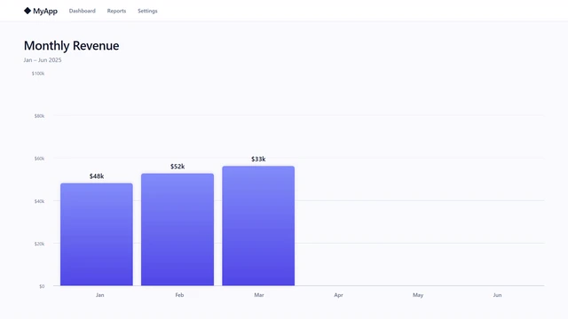
Bar Chart Reveal棒グラフリビール
Remotion video template: monthly revenue bars grow upward one by one with count-up numbers. Violet accent highlights the peak bar. 1920×1080 / 30fps / 10s.月次売上の棒グラフが左から1本ずつ伸び上がりながら数値がカウントアップするチャートリビールシーンの Remotion 動画テンプレ。1920×1080 / 30fps / 10秒。
remotionvideochart
View Details
R-005
R-005R: Video Template
Typing Code Revealタイピングコードリビール
Remotion video template: code types out character by character in a VS Code-style editor with syntax highlighting and a blinking cursor. 1920×1080 / 30fps / 12s.コードが1文字ずつタイプされながら現れるコードエディター風シーンの Remotion 動画テンプレ。シンタックスハイライト・ブリンクカーソル付き。1920×1080 / 30fps / 12秒。
remotionvideotyping
View Details
Connecting
Base
0x7A1B...29F4
B-001B: Web3
Wallet Connect Buttonウォレット接続ボタン
Connect MetaMask or any EIP-1193 wallet using window.ethereum only. Implements connect, disconnect, address display, and network display — no libraries required.MetaMask など EIP-1193 対応ウォレットを window.ethereum のみで接続。接続・切断・アドレス表示・ネットワーク表示をライブラリ不要で実装。
walletmetamaskethereum
View Details
Syncing
Ethereum
0x7A1B...29F4
ETH Balance
2.8451 ETH
B-002B: Web3
ETH Balance DisplayETH 残高表示
Fetch and display the connected wallet's ETH balance in real time using ethers.js v6. Supports loading state, refresh button, and network display.ethers.js (v6) で接続済みウォレットの ETH 残高をリアルタイム取得・表示。ローディング状態・リフレッシュ・ネットワーク表示に対応。